Hi Everyone,
I’m having a hard time figuring out the best way to render textures containing text images.
I’m talking about textured quads or textured cubes with a different text-image mapped on each face.
In particular I don’t know how to handle heavy minification scenarios: I tried trilinear filtering, anisotropic, different lod bias and [min level, max level] configurations without success (almost).
When using point sampling the texture is sharper and somewhat more readable compared to other methods, however there’s a lot of flickering when the textured objects moves.
When using tri/bilinear or anisotropic sampling the result is indeed more pleasing to the eye and the flickering is reduced but the text becomes too blurry to be read.
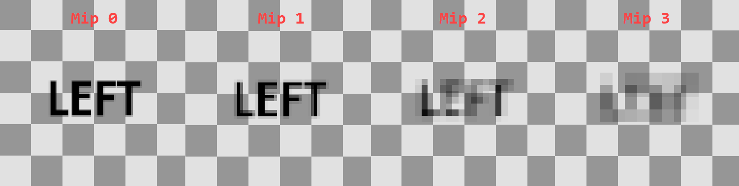
This is an issue when the approximate screen height of the text is about 5/15 px.
This is an example texture and it’s auto generated mipmaps.
I’m using the alpha channel (here shown as transparency) to interpolate between a background and a text color in my application.
What options do I have to display better texts while still using this same approach (textured quads)?
First off you can choose a good arbitrary size for each glyph to begin with, this might take a bit of tweaking at first, but ultimatelly it all depends on your current goal, keep in mind that this is not an all purpose fits all kind of approach, each aplication has its own needs, but picking a size of let’s say 64px (and then rescale it down to what fits best) for each glyph is fairly ok to many applications the intent to show HUD text at a usual size.
Then you can use a set of tricks to prevent flicker and blured contours, such as:
glTexParameteri(GL_TEXTURE_2D, GL_TEXTURE_MAG_FILTER, GL_NEAREST);
glTexParameteri(GL_TEXTURE_2D, GL_TEXTURE_MIN_FILTER, GL_NEAREST);
This will give you the retro, pixelated style (when using small fonts) or a sharp/clearer end result (when using bigger fonts), but although this can solve some of the previous issues, it goes with other set os problems itself when rasterizing it.
You can also try to check on the Distance Fields (or Signed Distance Fields) font approach technique, as mentioned here:
Basically not only will this give you a better control over the font’s glyph border, but it will also give out many other set of features such as outlines, shadow, bold, thin (when using gradients):